I whipped this up after doing a series of sketches. The initial sketches I imagined doing a city scape with the river below it. The sketch was very rough and it just didn’t feel right and the words didn’t blend well.
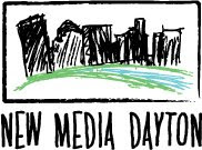
I thought about making the illustration blockier.

Then I thought about using the initials as part of the “grass and trees” of the city and using the negative space below as the river.
This is the new New Media Dayton logo (as seen in the LinkedIn group):