I was contacted by Jim about doing a logo design. I had first found his work online while I was looking for local photographers in the area several years ago. I had already a good idea of the style he needed and after a brief phone conversation I knew which directions to go with.

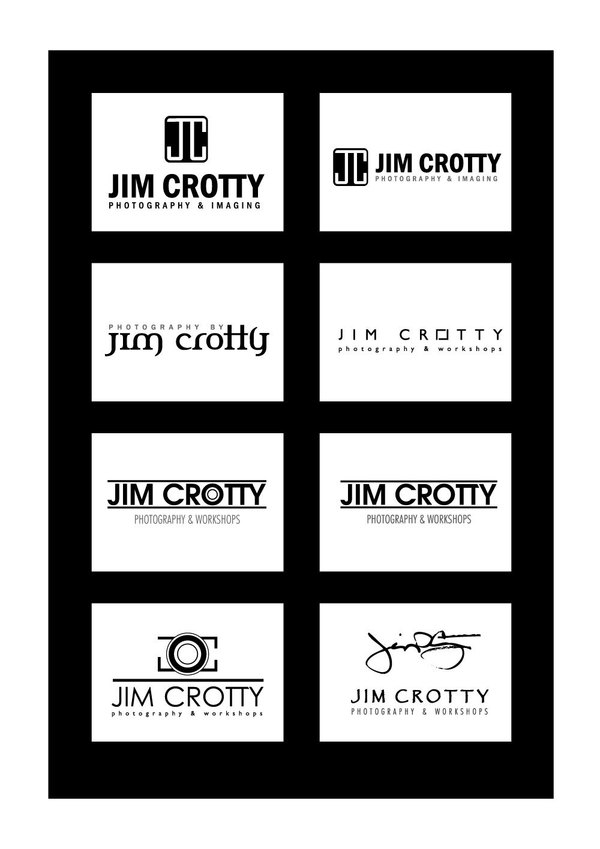
Sometimes it’s easier when the client is specific about the color scheme being black and white. This was the first round of concepts I delivered to Jim. Some were just treatments of his name, some included an icon or graphic (even though he didn’t request it – I wanted to give him that option), and one was his signature with the Papyrus font treatment of his name since that is what he uses in promotional materials and most publications.
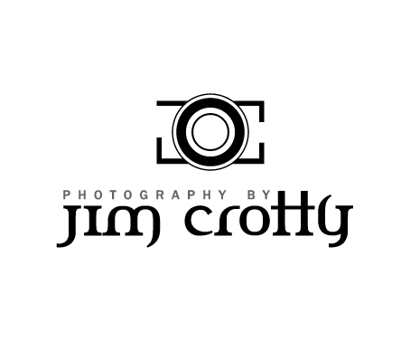
He liked the Celtic feel of the second from the top left but also the bottom left and asked if I could attempt incorporating both.
