Learning For the Digital Age

While working at Public Media Connect (CET/ThinkTV PBS stations) as Art Director, I was solely in charge of developing a complete identity for a new education initiative funded by eTech Ohio (state). My role (each station was given a role for the project) was to develop the look and feel, style guide, and the collateral materials.

The entire project timeline was less than one month.

The logo was developed in different colors (green and orange) as well as a black and white version both horizontal and stacked.

I developed a brand guideline for use by the stations and also for any vendors they might use for the project.

Covered subject included:

  • Project overview
  • Branding overview
  • Logo usage and color
  • Imagery guidelines
  • Font guidelines
  • Sample templates


A series of flyer and postcard templates was produced so the stations could update for their own workshop information and schedules.

I also developed a PowerPoint template with swappable photos so the stations had a larger range of editability.

A sample website template was delivered to the stations as well. The website was built using HTML/CSS (utilizing @font-face) with PHP includes.

Starting with the NorthWest Ohio Education Technology Foundation, more places have begun to incorporate these materials.

Nipawin Bible College Website Redesign

The old site did not allow the client to be able to edit anything themselves (and certainly not easily). They also wanted to have a visual separation of areas, even though there were tabs for those areas. The client wanted it more obvious that you were in a different section. The design was also 4 years old – in need of an update.

The new site is built in Joomla with separate access for the client and the alumni to edit so the alumni has no access to the main site.

The initial wireframe was presented to the client:

After a few modifications, the current layout and design was made into a reality:

Everything on the front page is fully editable, including the flash image slider (XML-driven) and the news scroller (jQuery – client can edit in the article). An added feature was the search button which will give results for the entire website. Each tabbed section has a different background and some have varied color schemes.

Check it out at www.nipawin.org.

Learn to truly value yourself and your business

Quality is a case that is going down the tubes and is being replaced with the word “value”. Why pay $50 for a product when you can get a similar one for $10 made in China? Why pay $500 for a logo when someone will do it for $50?

Freelancers get caught up in this world. They think they need to compete with those other designers because they won’t get any jobs that way. They labeled their services as “cheap”. I saw a post by a fellow alumni (although years later than me) in an advertising venue for “cheap” design. I know the kind of work that comes from the college I went to and I visited the portfolio of said alumni. The work was good. Very good. It was truly quality work that wasn’t worth “cheap”. You need to value yourself. If your work is good, why allow the bottom feeders to take advantage of it? Don’t sell yourself short. You are worth more. If someone isn’t willing to work with your rates, they aren’t worth working with because they won’t value you. They don’t care about what YOU do, just that you can do it. If people didn’t value what they had to offer they wouldn’t be in business. It works both ways.

The same goes for businesses. Do you ever consider anything made in China a quality product? Cheap labor tends to produce shoddy results. They break. They can’t stand the test of time. They don’t dedicate the proper time to test their products (how many lead/toxins/breaking product recalls do you hear about?). The same thing goes for design. If you are going to hire a designer, “cheap” is going to give you a product that was not properly thought out. You can’t dedicate the time required to produce a quality product. You might see those website deals like on Intuit, but guess what? You still need to have a logo made. You have to pay a monthly service fee. Even at the base package level you are limited on page amounts. You can’t even really “own” the design. In fact, even though they offer a design service for the website, it’s about the same price as me (and I offer copyright transfer on layout – though at an additional cost – at least you have the option).

Think about the following that adds value:

  • Brainstorming/Concepting
  • Client/Audience Research
  • Copyright Transfer
  • Color Options
  • Style Guides
  • Fully Customized Design
  • Ease of Communication/Accessibility
  • Refreshing an existing site
  • Adding a CMS to an existing site
  • Fully HTML/CSS-based layouts (no tables except for data!)
  • A site tested in multiple browsers
  • A site tested to meet validity checks

In the long run, it’s worth it. It’s a two-way road. We have to value each other.

When is a font just a font?

When it’s Comic Sans – at least to some people.

I’m a member of the Creative Design Pros group on LinkedIn where I provide advice, opinions, suggestions, etc. Recently, there was a member (an interior designer) who posted her website for feedback. The entire thing wasn’t even a design – it was a background, a blob of text, and 4 thumbnail photos. It reminded me of what I made in high school when I was learning HTML (and I suppose she was). What really caught my eye was the blob of text.

It was all keyed in Comic Sans. I obviously didn’t take the thing seriously and I told her no one else would. She didn’t understand – she didn’t even realize many people knew what the font was. She said it was “a flowing cursive yet legible script”.

That was the indicator she had no idea what typography was all about. I didn’t really expect her to – she never claimed she was a web designer. Comic Sans is a handwritten font, neither cursive or script.

She didn’t care if professionals didn’t like it. She wanted the average Joe to like it. It was just “a font” to her.

In all reality, Comic Sans was designed for comic strip conversation bubbles because at the time, Times was being used.

That is all it is good for. Comic Sans is for people who do not understand typography and would rather look like a child than a professional. It doesn’t matter who your client happen to be – you need to make sure they realize YOU are a professional.

This site says it all: http://bancomicsans.com/main/?page_id=2

While some people would say, hey if the average Joe likes it, then use it, I say the average Joe likes it because they don’t know any better. It’s up to us a graphic designers to deliver appropriate solutions – including typography and help them understand our choices. Comic Sans was meant as a solution for comic strip conversation bubbles – nothing else.

While Comic Sans might be “just a font” to those who don’t know anything about fonts, to professionals it is the scourge of the industry because as Ban Comic Sans so eloquently puts:

Like the tone of a spoken voice, the characteristics of a typeface convey meaning. The design of the typeface is, in itself, its voice. Often this voice speaks louder than the text itself. Thus when designing a “Do Not Enter” sign the use of a heavy-stroked, attention-commanding font such as Impact or Arial Black is appropriate. Typesetting such a message in Comic Sans would be ludicrous. Though this is sort of misuse is frequent, it is unjustified. Clearly, Comic Sans as a voice conveys silliness, childish naivete, irreverence, and is far too casual for such a purpose. It is analogous to showing up for a black tie event in a clown costume.

Converting a vector letterhead for use in Word 07

Whenever I do identity kit designs (stationery), I always provide my clients with a Word version of their letterhead. If there was bleed on the original, I create a version without it. This way the client has the ability to send Word documents containing their branding as well as a backup in case they run out of their printed letterheads. I’ve created this tutorial upon request to show you how I do it.

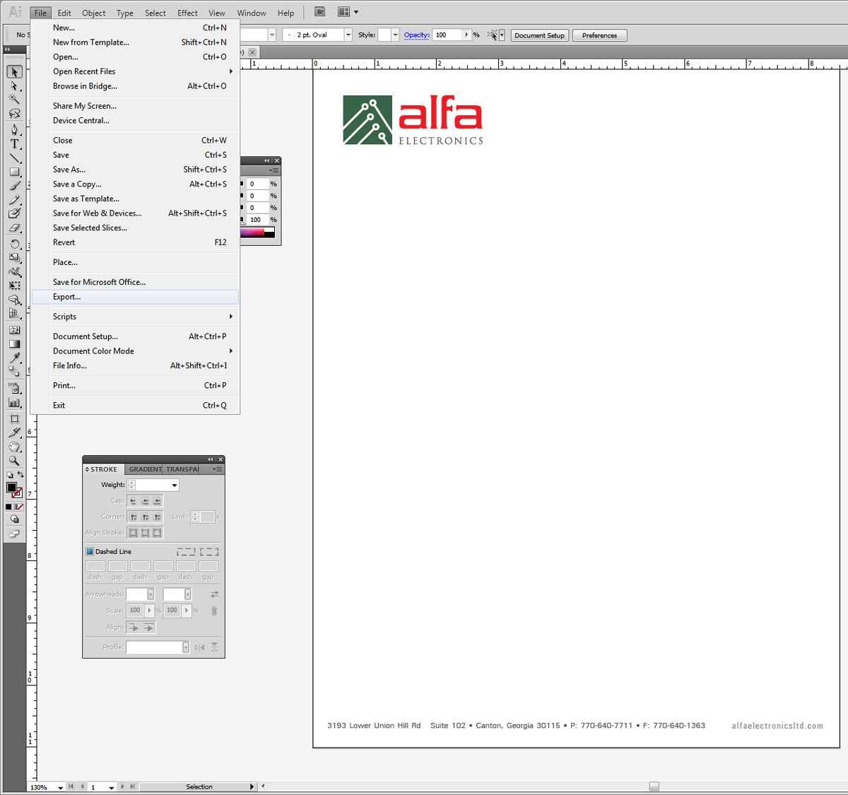
I’m going to use Alfa Electronics as an example in this case since there wasn’t any bleed.

Here is the original vector art:

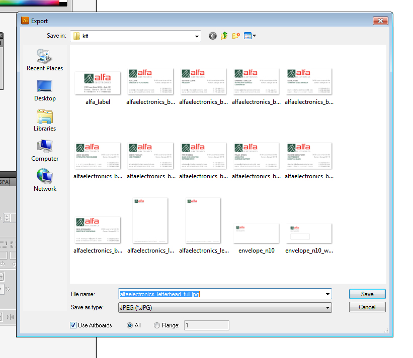
First off, make sure you have the artboard the same size as the printed piece will be (in the US it’s letter). We can do the export two ways. In Illustrator, go to File > Export.

Choose JPEG and then check “use artboards” as we want to make sure it’s 8.5″x11″. In CS5 if you had any more documents in there (such as the entire kit), you would want to click “range” and tell it which artboard to use.

Make sure that you choose maximum quality, RGB (since they will probably not use a CMYK printer in-house), and 300 DPI.

Then click OK.

If you have a solid header/footer you can go into Photoshop, open the JPG, crop out the top and bottom as separate files and save them separately. You could also keep this entire large image for the header/footer as one large background. That’s what we are going to do.

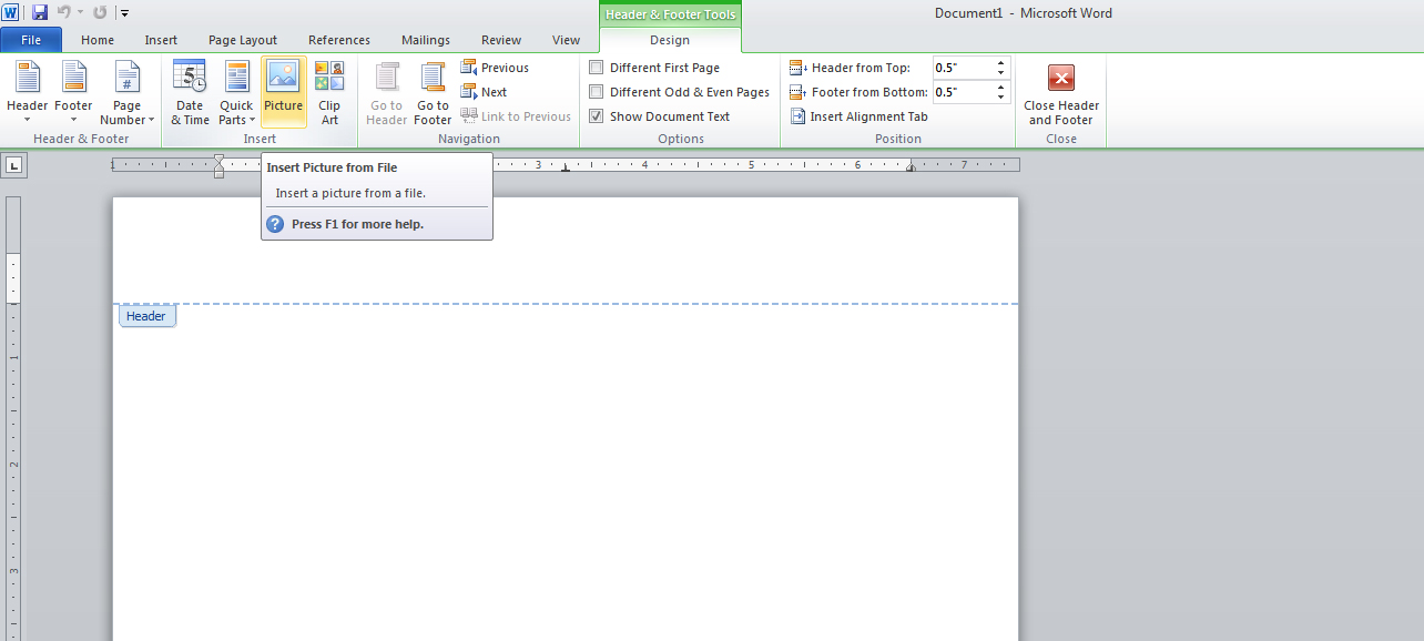
Let’s open Word. Double click on the top part of the document to open up the header/footer. If you aren’t sure how to do this, go to “Insert”, then click on “Header” and then click “Edit Header”.

 Now once the header is opened we need to insert the letterhead so under the tab “Insert”, click “Picture”.

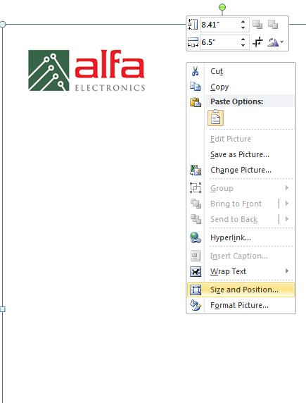
Find the full image and insert it.

 It’s probably going to look like this: too small. We need to make it the correct size so right click and choose
 “Size and Position”.

 Click “Reset” and then OK.

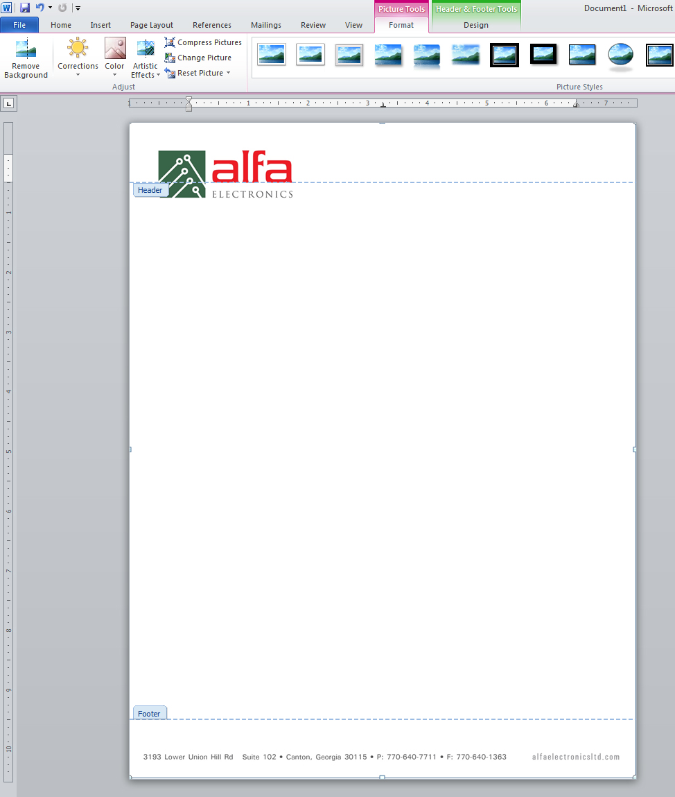
 Now it should be the right size, but it is not correctly aligned.

 We need to edit the text wrapping now. Right click and choose “Behind Text”.

 Once that is done, you just need to move the image around so it’s positioned correctly.

 Now you can close the Header/Footer. To do this, go to the “Design” tab and choose “Close Header/Footer”.

 Now we need to set up the margins for the text because right now the cursor is in the logo.

On the rulers, just drag to your preferred margin allowance. For this design, I want the cursor to start at the “alfa” type and leave available space under the logo. The bottom margin is fine already.

This is what it looks like fixed:

Set up your preferred fonts. You can now save the document because that’s all there is! To do the process with individual header/footer pieces, you still need to reset the size and do the text wrapping and positioning, you will just have one image file for the header section and one file for the footer section.

Now here it is with content inside.